
As promised, last week Google rolled out an update to their search engine which gives priority to websites that are mobile-friendly. I’ve read a number of blog posts about this and none mentioned that this applies only to mobile search results. In other words, if you’re doing your Google search on a desktop, you’re likely to see a different order of search results than if you were doing it on your mobile phone.
However, while some blogs make it sound universally dire (terming it “Google’s Mobilegeddon”), this isn’t to say that Google’s change isn’t vitally important. After all, how many of us reach for our laptop when we’re looking for a place to eat or trying to find something quickly? I would expect that it’s only those whose phone battery has died. Mobile search is important.
Google defines mobile-friendly as a page “where text is readable without tapping or zooming, tap targets are spaced appropriately, and the page avoids unplayable content or horizontal scrolling.” Google now analyzes your site for those characteristics and downgrades your mobile search ranking if they’re missing. This doesn’t mean that everything is based on mobile-friendliness – “we still use a variety of signals to rank search results,” they say – but it does mean that your site is now harder to find if it isn’t mobile-optimized.
A Mobile-Friendly Site is Friendly
Just because your site’s pages meet Google’s criteria of mobile friendliness, it doesn’t mean that your site magically becomes a goldmine. As they state in their own blog post, any site can rank high if it has great content relative to the search query. Google’s job is to provide rich and relevant content, so even if your site looks fantastic on a mobile browser, your ranking will remain low without regularly-updated, relevant content.
Google’s own 2012 study of mobile users’ expectations found that 61% said they’d quickly move onto another site if they didn’t find what they were looking for right away. 74% who visited a mobile-friendly site said they were likely to visit that site again in the future. A friendly site makes friends.
Although increasing your search rankings is important, your customers’ satisfaction is more important. If your customers’ first preference is to view content on a mobile browser, then create customer loyalty by providing them a great mobile experience.
Where to Start?
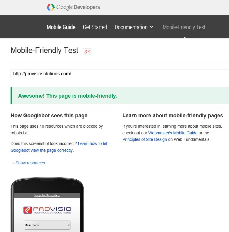
If your site has been professionally designed within the past three years then there’s a good chance that it’s mobile-optimized. Any good web designer should have built that into the project. However, Google has made it easy to check by providing a Mobile-Friendly Test page.
Test More than the Home Page
Google’s update applies to individual pages, not entire websites. So even though your home page may pass the test, if the inside pages that contain the content do not, you’ve not gained much. It may seem tedious, but it’s well worth the effort to test each page on your site. If you have a Google Analytics account then you can speed up the process with the Mobile Usability section of their Webmaster Tools.
Making Friends
Mobile friendliness may not be the panacea to ensure your company’s success, but a mobile-friendly site is sure to make more friends, and what business couldn’t use more friends?