Windows 8 has been available to the public since Microsoft announced the availability of its Consumer Preview back on February 29. (Leaping ahead on Leap Day?) There have been a number of subsequent iterations, including the more recent Enterprise evaluation edition which I’ve been using for the past week. This is the version that IT professionals will be looking at to see whether there are any compelling reasons to adopt it in the enterprise. Microsoft’s attractive upgrade pricing will encourage IT departments to reconsider finally moving their users from the venerable XP, especially since Windows 8 can run on older hardware even better than Windows 7.
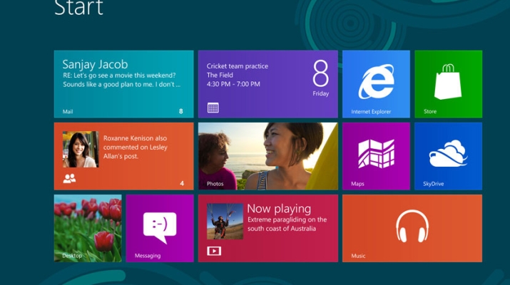
The real hurdle for most companies will be the fundamental change in the interface. Large, flat tiles make sense on a touch-oriented tablet, but they seem out of place in the point-and-click environment. Even the “desktop” interface, which maintains the familiar look of Windows 7, lacks the quintessential defining feature of the Windows experience: the Start button. Many users will be baffled, and it will take some focused effort by Microsoft to provide enough visual cues to keep users from pounding their fists against their screens (actually, this may help if they have touch-enabled displays).
As I mentioned in my post about the Microsoft Surface tablet, there’s a lot of anticipation in the tech world for this upcoming new approach by Microsoft. Reviews of the evaluation versions have both panned it and praised it, some expressing disgust for its “fractured” experience and others lauding its game-changing prescience.
Paul Thurrott posted part 1 of his Windows 8 review yesterday, addressing many of the pundits’ concerns and giving a balanced view of what makes Windows 8 a worthy upgrade option to consider. After using Windows 8, both the Consumer Preview on a tiny netbook and the Enterprise preview on my Toshiba Portege, I’m excited to try it with touch-enabled hardware. While I’ve found aspects of the interface to be initially confusing, I’ve been pleased to see that Microsoft has added short tutorials during the setup process to prepare you for this new way of interacting with your computer.
My overall impression is that Windows 8 is, well, kind of fun. The more I’ve used it, the more I’ve come to enjoy the experience. I like the live tiles brought from the Windows Phone experience, even if clicking them with a mouse seems counterintuitive. I like how easy it is to access administrative tools. I like the clean lines and readability of the Metro UI (I still call it that even if Microsoft doesn’t anymore). I like the integration with cloud services such as SkyDrive. I like the way it syncs your settings across devices using your Microsoft account.
And speaking of the cloud, Windows 8 is portable in a way that no other Windows OS has ever been. It may not be enough to convince the executive to replace their iPad, but then again, if he or she relies on Windows when at the office, it just may be.
